

UI Generation
Vibemap goes beyond high-level architecture by generating actual UI designs and functional code for your project components. This allows you to bridge the gap between "Requirements" and "Implementation" in seconds, providing a tangible preview of your application.
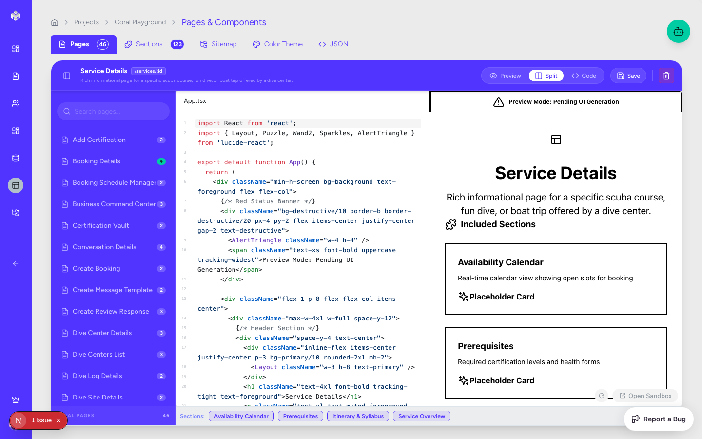
Accessing UI Generation
Navigation
UI generation is integrated directly into the Pages and File Structure sections, as the UI is fundamentally tied to the application's structure.
Navigate to the Pages tab.
Select a specific page or component from the explorer tree.
Click the "Generate UI" button in the main content area.
UI Workspace Layout
Preview Area: A live-rendered view of the generated component.
Code Explorer: A side-by-side view showing the React/TypeScript code.
Style Sidebar: Controls for theme, layout, and framework preferences.
Generating UI Components
The Generation Process
Context Analysis: The AI subagent reviews the User Stories and Acceptance Criteria associated with the page to determine required fields and interactions.
Design Language Selection: The system applies your project's Color Theme and chosen design system (e.g., Tailwind, Material Design).
Drafting & Layout: The AI creates a responsive layout using modern UI patterns.
Code Emission: The system generates clean, readable, and functional React code.
What Gets Generated
Functional React Components: Next.js-compatible components using TypeScript.
Tailwind Styling: Modern, utility-first CSS that matches your brand's vibe.
Interactive States: Loading states, button hover effects, and form validation logic.
Responsive Layouts: Design logic for Mobile, Tablet, and Desktop breakpoints.
Mock Data: Sample content to populate the UI for a realistic preview.
Design Styles & Frameworks
Style Preferences
Vibemap supports multiple aesthetic directions:
Modern/Minimal: Clean lines, ample whitespace, and focused typography.
Material Design: Following Google's design language for familiarity and accessibility.
Enterprise/Saas: High-density layouts designed for data-heavy applications.
Custom Branding: Integration of your specific color palette and logo assets.
Framework Compatibility
While Vibemap defaults to Next.js (React) and Tailwind CSS, the underlying logic is designed to be framework-agnostic.
TypeScript: All generated code is strictly typed for developer productivity.
Component Libraries: Support for popular libraries like shadcn/ui, Radix UI, and Lucide Icons.
Managing Generated UI
View & Preview
Live Preview: See how the component looks in real-time.
Device Toggles: Switch between mobile and desktop views to test responsiveness.
Code Editing & Sandbox
Direct Edit: Modify the generated code directly in the browser to fine-tune details.
Regenerate: If the output isn't quite right, you can tweak the Acceptance Criteria and hit regenerate to see an updated version.
Exporting UI
Copy Code: One-click copy for pasting into your local project.
Download Scaffold: Download the entire page as a
.tsxfile including all necessary imports.
UI Quality & Standards
Vibemap adheres to modern web standards:
Accessibility (a11y): Use of semantic HTML and ARIA labels.
Performance: Optimized rendering patterns and minimal CSS overhead.
Maintainability: Clean component architecture with logical prop structures.
Next Steps
After generating your UI, you can move to the Technical Documentation or Technical Export sections to see how these UI components fit into the broader system architecture.
Last updated
Was this helpful?