

Pages and Components Generation
The Pages and Components section is where you define the information architecture and UI structure of your application. Vibemap analyzes your features and user stories to generate a complete sitemap and component breakdown, providing a bridge between logical requirements and visual implementation.
Accessing Pages Section
Navigation
Navigate to the project sidebar.
Click the "Pages" tab.
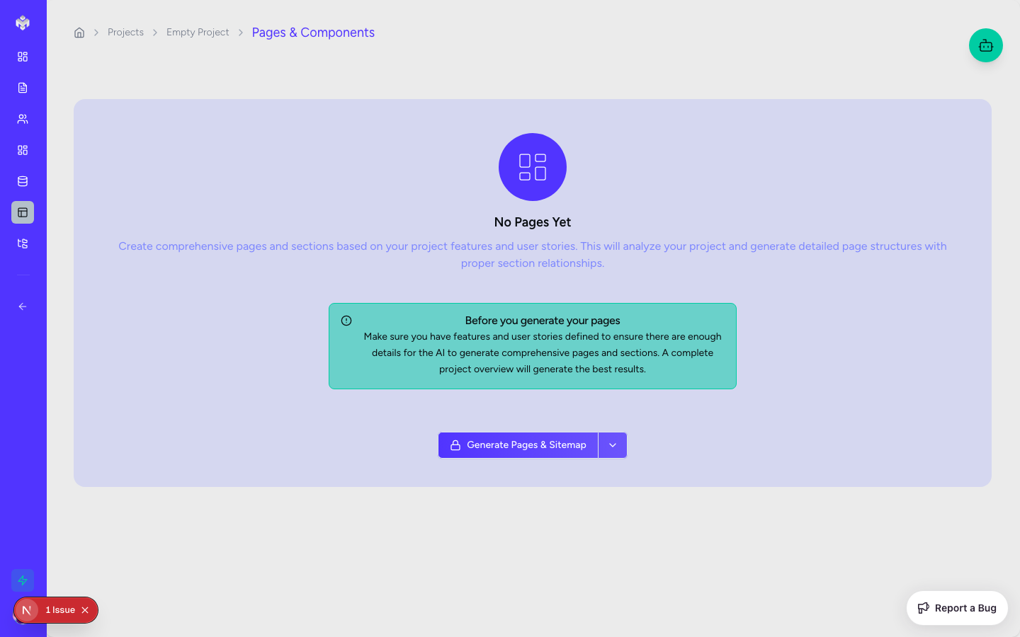
If no pages exist, you'll see a "Generate Pages & Components" button.
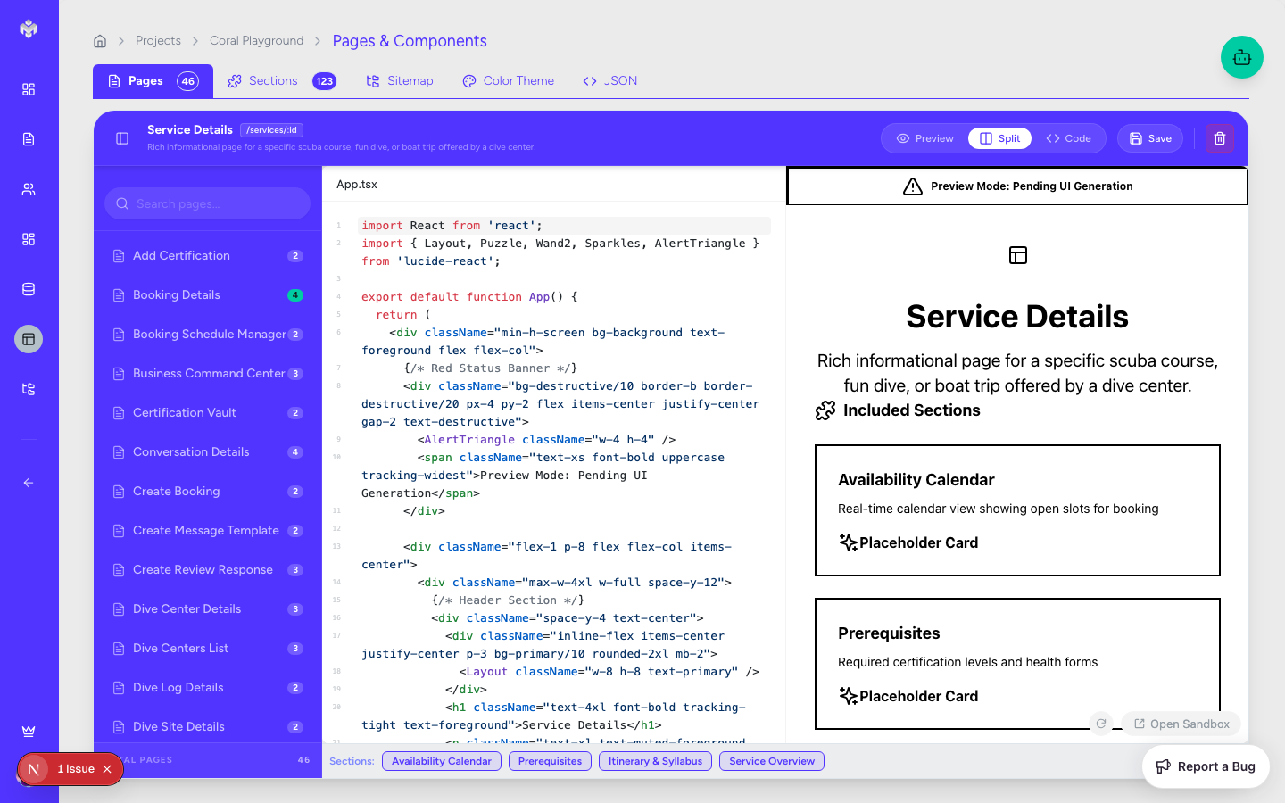
Page Workspace Layout
Header Section: Contains generation controls, manual add buttons, and global filters.
Tabbed Views:
Pages Explorer: A hierarchical view of the app's navigation.
Sections Table: A granular list of all UI sections across the project.
Sitemap: A visual flow representation of page hierarchy.
Color Theme: The visual tokens for your project's design.
Action Sidebar: Tools for editing page metadata and linking user stories.
Generating Pages and Components
The Generation Process
Click the "Generate Pages & Components" button.
The AI subagent reviews your Features, User Stories, and Business Goals.
It maps functional requirements to specific views (Pages) and logical UI chunks (Sections/Components).
The result is a complete structural blueprint of your application's frontend.
What Gets Generated
Page Hierarchy: A logical structure of main routes and nested pages.
UI Sections: Reusable sections like "Hero", "Features Grid", or "User Profile Header".
Component Definitions: Atomic components like buttons, inputs, and cards required for each section.
Sitemap: A visual map of how users navigate the system.
Color Theme: A suggested palette (Primary, Secondary, Accent) that matches your project's vibe.
Page and Component Types
Vibemap generates a wide variety of standard and custom page types:
Page Categories
Landing/Marketing: Home, About, Features, Pricing.
Dashboard/App: User Overview, Analytics, Project Management.
Form-Heavy: Profile Settings, Registration, Data Entry.
System: 404 Error, Login, Password Reset, Loading states.
Component Categories
Navigation: Headers, Sidebars, Footers, Breadcrumbs.
Data Display: Information Cards, Data Tables, Charts, Modals.
Interaction: Input Fields, Date Pickers, Action Buttons, Selection Menus.
Layout: Content Containers, Responsive Grids, Page Wrappers.
Manual Architecture Management
Managing Pages
Add Page: Manually define a new route with a name, URL path (e.g.,
/settings/security), and page type.Edit: Update page descriptions or change the status from "Not Started" to "In Progress".
Priority: Assign priorities to pages to help your team focus on the "Critical Path" first.
Managing Sections and Components
Cross-Page Reusability: Identify sections that appear on multiple pages to ensure consistent design.
Dependency Mapping: See which components are required by which sections.
Status Tracking: Monitor the development progress of individual UI elements.
Deletion and Impact
Navigation Impact: The system will alert you if deleting a page breaks navigation links from other pages.
Component Impact: If a component is used across multiple pages, you'll be warned before removal.
Design Theme & Consistency
Vibemap generates a Color Theme that serves as the "Source of Truth" for your UI generation.
Tokens: View hex codes for Primary, Secondary, Background, and Text colors.
Customization: You can manually update these tokens to align with your brand guidelines.
UI Sync: When you generate code, the system uses these specific colors in the Tailwind configuration.
Next Steps
Once your structural map is finalized, you can proceed to UI Generation to see these abstract pages and components turned into functional React code.
Last updated
Was this helpful?